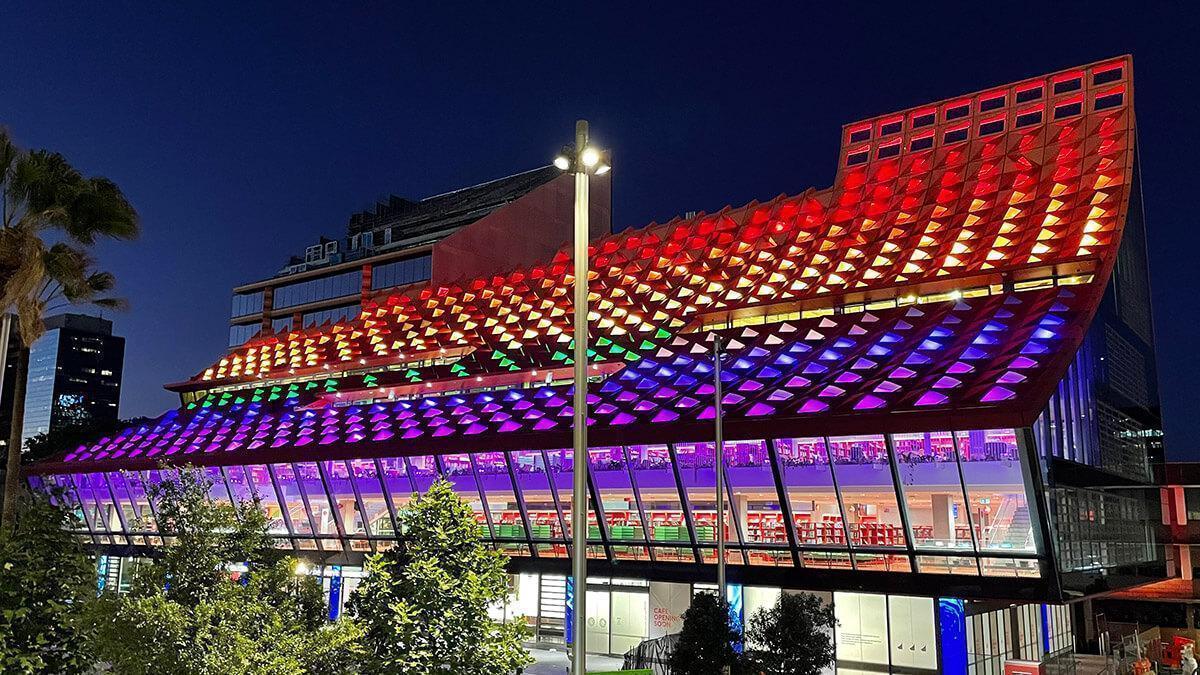
CLS fixtures turn an Australian architectural icon into an illuminated work of art.
PHIVE is an architectural icon, with a bold design by award-winning French architect Manuelle Gautrand, in collaboration with Australian architectural firms Lacoste + Stevenson and Design Inc.
In 2016 they submitted a design as an assignment for a design competition for the new community center. In this design, the colors of the building – shades of red and orange that lighten as they reach closer to the sun – are inspired by the colors of the red sand and native flowers in Australia. The colors of the tiles also lighten as the building progresses towards the sun.
PHIVE is a significant building for society in 6 areas. With a extensive library, flexible community and business spaces, and creative spaces for various applications, everyone can go here. In addition, the builing lends itself perfecty for the organization of various events and exhibitions. There is also a customer contact center and visitor service, a café where you can dine and take away, and the city council has their rooms here.
The lighting had to enhance this iconic building. The arches in the design made it possible to create something unique with light. To achieve the effect the architects had in mind, they went looking for an RGBW fixture that infringed as little as possible on the design of the building itself.
“CLS found this a wonderful challenge to take part in. In a project like this, lighting can really make all the difference. The vision of the architects was clear, and we managed to translate this vision into a lighting solution that matched it exactly, together with our partner from Australia, Xenian.” Jasper te Selle, Commercial Director | CLS LED
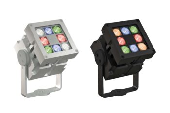
CLS looked at the possibilities with its Australian partner Xenian and ultimately chose fixtures from the Revo Series. The architect preferred to keep the fixtures the same outside and inside. The Revo Series with an IP67 classification was perfect for that. For this project, these fixtures, which are now in use in large numbers, have been anodized in the same color as their surroundings to create the most beautiful effect. Outside, the fixtures are provided with red anodization, and inside with white anodization. In this way, they blend seamlessly into their surroundings. This seamless blend was a strict requirement from the architect.
There were also many other wishes, like the cable length, cable colour, custom-made brackets, 48V versus 230V, lens configurations, etc. That is where the power of CLS really comes into play, and we like to think with you about how we can meet all those wishes. And all this within the project deadline. Thanks to direct and clear communication, we delivered the project on time, and we could make another customer satisfied.
The municipality found it important that the lighting is easy to adjust so it matches the events and happenings in Parramatta. For example, they had the building colored purple for the international day of People with Disabilities, and they had the building coloured gold and blue for the Parramatta Eels rugby team that would shine in the grand rugby final of 2022. The alteration of the colours is easy because they chose the DMX control option. That makes it very easy to create scenes, and the building looks different every time.
“It is always unique for a Dutch company to do business on the other side of the world. That is only possible if you have set up your organization properly and can provide the right service, even remotely. CLS now has a distribution network in more than 50 countries and continues to grow.”
Jasper the Selle, Commercial Director | CLS LED
ARCHITECTS Gautrand Architecture / DesignInc / Lascoste + Stevenson
PHOTOGRAPHY Brett Boardman Photography


